In today’s custom home interiors, Hyderabad homeowners want spaces that feel calm, luxurious, and deeply personal—not loud or randomly “colourful.” Colour has shifted from being a last-minute paint choice to a strategic design tool that shapes mood, light, and how every room is experienced. Used well, colour can make compact rooms feel airy, tall ceilings feel intimate, and open plans feel beautifully connected. Used poorly, it can create visual noise, fatigue, and a home that dates quickly.
This guide walks through how luxury interior designers think about colour so you can make confident, long-term decisions for your home.
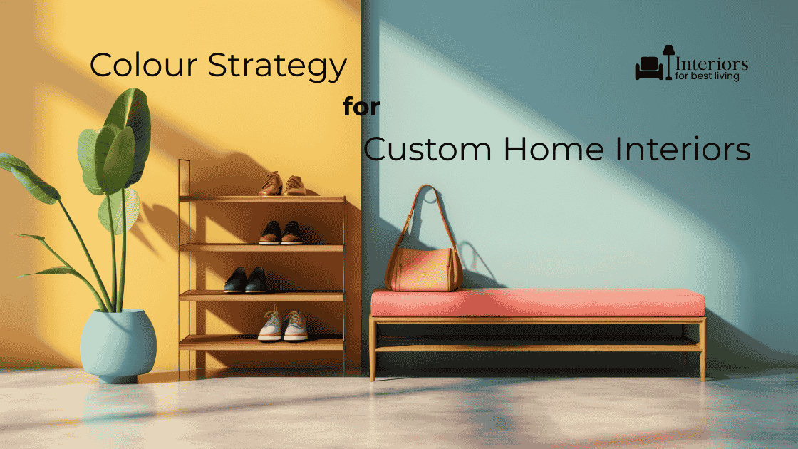
Why Colour Strategy Matters More Than Ever
Colour does much more than decorate walls. It:
- Shapes first impressions in living and dining spaces.
- Influences sleep quality and calm in bedrooms.
- Affects focus in work zones and study areas.
- Impacts how large or small a room feels.
In a city like Hyderabad, with strong natural light, warm weather, and a mix of apartments and villa interior design, colour choices must also respond to climate, dust, and lifestyle. The goal is not to chase trends, but to build a palette that feels timeless, adaptable, and authentic to you.
Start with a Whole-Home Colour Vision
Before picking individual paint shades, step back and think of your home as a single, connected story. Custom home interiors Hyderabad-wide feel more premium when colours flow smoothly from room to room rather than changing abruptly at every doorway.
A helpful approach is:
- Choose one base neutral that works across most spaces.
- Add two or three supporting neutrals for depth and variety.
- Layer in a few accent colours placed thoughtfully, not everywhere.
This gives you a strong framework. Walls, ceilings, floors, furniture, and soft furnishings then become variations inside that structure, not random experiments.
Understanding Neutrals: Your Foundation for Luxury
Neutrals are not “boring” when chosen well. They are the quiet background that allows furniture, art, and architectural details to shine.
Common neutral families:
- Warm neutrals: beige, taupe, greige with a hint of brown or yellow.
- Cool neutrals: soft greys and blue-toned whites.
- Earth neutrals: clay, sand, stone-inspired hues.
In contemporary luxury interior designers’ projects, warm neutrals often work beautifully for Hyderabad’s light and context. They hide dust better than stark whites, feel inviting, and pair smoothly with natural materials like wood and stone.
Where to Use Neutrals
- Main circulation areas: foyers, passages, open-plan cores.
- Large walls in the living and dining rooms.
- Ceilings, which usually work best a notch lighter than walls.
With this base in place, you can safely introduce stronger colours without overwhelming the space.
Using Colour to Shape Space and Mood
Make Rooms Feel Larger or Calmer
Light, low-contrast palettes make rooms feel more expansive and airy. This is useful for apartments or smaller rooms. Darker or richer tones can work well in larger villas where you want intimacy and depth.
- Small rooms: soft off-whites, pale greige, light stone tones.
- Large rooms: mid-tones, rich neutrals, or one deeper accent wall balanced with lighter surroundings.
Adjust Perceived Ceiling Height
- To make ceilings feel higher: keep ceilings lighter than walls and avoid heavy borders.
- To make a very tall space feel more intimate: use a slightly deeper shade on the ceiling or introduce a darker tone in the upper portion.
This is especially useful in villa interior design with double-height or tall living rooms.
Support the Room’s Function
Each room has a job. Colour can support that purpose.
- Living rooms: warm neutrals with one or two accent colours for interest and conversation.
- Bedrooms: restful tones—soft blues, muted greens, warm greys, or gentle blushes.
- Kitchens: clean, bright palettes that still feel warm and inviting.
- Home offices: balanced tones that don’t strain the eyes—dusty greens, soft blues, or calm neutrals.
Accent Colours: Where and How Much
Accent colours are like jewellery. They should highlight, not dominate. Overusing them can quickly make a home feel busy.
Effective ways to use accent colours:
- On one feature wall or panel, not every wall.
- Through loose elements like cushions, throws, rugs, and art.
- In smaller, controlled areas such as niches, headboard walls, or back panels in shelving.
In traditional home interiors, accents can also come through fabrics, carved pieces, brass, or artwork rooted in culture. The wall colour then plays a supporting role rather than fighting for attention.
Balancing Colour with Materials
Colour never exists alone—it sits beside flooring, furniture, and finishes. Strategic colour design always considers:
- Flooring tone: warm beige marble, grey tiles, and wooden flooring all influence what works on walls.
- Fixed finishes: wardrobes, kitchen cabinets, doors, and windows.
- Metal finishes: black, brass, bronze, or chrome all carry a visual temperature.
A good rule:
- If materials are visually busy (veined marble, patterned tiles, ornate furniture), keep wall colours calmer.
- If materials are very simple, you can push colour a bit more confidently on selected walls.
Colour Strategy in Different Areas of the Home
Living Room
This is usually the heart of custom home interiors Hyderabad homeowners showcase to guests. Here, aim for:
- A neutral base on major walls.
- One controlled focal element—an accent wall, artwork, or a material like stone or wood.
- Soft repetition of one or two accent shades in cushions, décor, or rugs.
The colour palette should feel welcoming during the day and sophisticated at night when artificial lighting takes over.
Dining Area
Dining spaces sit at the crossroads of food, conversation, and culture. Warm, earthy tones often work well—soft terracotta, muted olive, warm taupe—paired with neutral surroundings. These colours feel comforting and photograph beautifully under warm lighting.
Bedrooms
Bedrooms are retreats. They should support rest, not demand attention. Ideal choices include:
- Soft greens and blues with grey or beige undertones.
- Gentle, smoky mauves or blushes, carefully desaturated.
- Layered neutrals with depth coming from texture rather than strong colour.
Bolder colours, if desired, usually work best behind the bed as part of an accent wall or upholstered headboard backdrop.
Pooja Rooms and Traditional Corners
In more traditional home interiors, pooja rooms and spiritual corners often carry symbolic colours—saffron, marigold, deep reds, or rich gold accents. In modern homes, these can be softened:
- Use these tones in artwork, back panels, or fabrics.
- Keep surrounding walls neutral so the sacred area stands out naturally.
This approach honours tradition without overpowering the rest of the home’s palette.
Modern Colour Principles to Remember
1. Limit the Palette
Homes feel more expensive when the palette is edited. A common working formula:
- 60% main neutral.
- 30% secondary neutrals and natural materials.
- 10% accents.
This is not a rigid rule, but it helps prevent overuse of strong colours.
2. Respect Natural Light
Colours look different in morning light, afternoon sun, and evening artificial lighting. A tone that seems fresh on a paint card can feel harsh on a full wall. Always evaluate key shades on the actual wall, at different times of day, before final commitment.
3. Prioritise Longevity Over Trends
Trend colours are fun but can date your home quickly when used in large areas. Luxury interior designers often use fashionable shades in smaller, changeable elements and keep walls and large surfaces more timeless.
4. Ensure Harmony Across Floors and Levels
In villas, ground and upper levels should feel like parts of the same home. Each level can have its own flavour, but there should be shared tones or materials to tie everything together—especially in staircases and landings.
Why Expert Guidance Makes Colour Decisions Easier
Colour seems simple until you combine it with light, materials, scale, and long-term use. This is where expert help changes everything:
- Professionals see undertones and shifts that are easy to miss on small samples.
- They align colour decisions with furniture, flooring, and joinery that may already be locked in.
- They design for how your home will feel five years from now, not just on handover day.
Involving designers early is especially helpful in custom home interiors Hyderabad projects where flooring, cabinetry, and wall finishes must all harmonise. Adjusting paint is easy—but fixing clashing tiles, wardrobes, or kitchens is not.
Bring Your Home’s Colour Story to Life with LH Interiors
Strategic colour is quite powerful. It can make your home feel larger, calmer, warmer, or more refined without a single wall being moved. With a clear vision, a restrained palette, and thoughtful placement, colour becomes one of the most cost-effective tools for transformative change.
Whether you are designing a new villa interior design project or refreshing an existing apartment, LH Interiors can help you craft a colour story that reflects your personality while respecting architecture, climate, and long-term comfort. From selecting base neutrals and accent walls to coordinating fabrics, art, and finishes, every choice is guided by design authenticity and lasting elegance.
If you are ready to move beyond guesswork and random shade cards, consider scheduling a consultation. Together, you can shape a home where every room feels connected, every corner feels intentional, and colour quietly supports the life you want to live.