Interior designing is the creative and strategic process of enhancing the interior of a space to make it more aesthetically pleasing, functional, and aligned with the taste and lifestyle of its occupants.
Put simply, interior design shapes how a space looks, feels, and works—whether it’s your living room, office, kitchen, or bedroom. It combines design principles with artistic vision to deliver an experience that is both beautiful and purposeful.
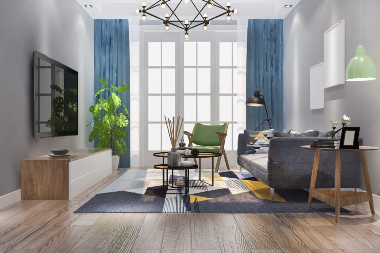
Colours aren’t just visual—they influence mood, energy, and perception. Warm colours create coziness, while cool tones like blue and green promote calmness. Thoughtfully chosen colour schemes can enhance how a room feels and behaves. For example, green in a living room creates a peaceful, natural vibe.
Color theory is the conceptual framework that guides how colors interact, blend, and affect human emotions and behavior. It’s based on the color wheel, first developed by Sir Isaac Newton, and is used in visual arts, interior design, fashion, branding, and more.
The color wheel organizes colors in a circular format and is divided into:
These are the base colors from which all others are derived:
Red
Blue
Yellow
Made by mixing equal parts of two primary colors:
Orange (Red + Yellow)
Green (Blue + Yellow)
Purple (Blue + Red)
Created by mixing a primary color with a neighboring secondary color. Examples:
Red-Orange, Blue-Green, Yellow-Green, etc.
Color harmony refers to visually pleasing arrangements of colors. Below are the most common and effective color combinations:
Opposite each other on the color wheel (e.g., Red & Green, Blue & Orange)
High contrast, bold, and energetic
Great for calls-to-action, sports brands, or dining areas
Side-by-side on the wheel (e.g., Blue, Blue-Green, Green)
Soft and harmonious
Ideal for interior design, nature-inspired palettes, and calming visuals
Different shades and tints of the same color
Minimalistic, elegant, and balanced
Common in modern design and branding
Three colors evenly spaced around the wheel (e.g., Red, Yellow, Blue)
Balanced yet vibrant
Suitable for children’s products, creative brands, or bold interiors
Two sets of complementary colors (e.g., Blue & Orange, Red & Green)
Complex and dynamic, offering rich contrast
Needs careful balance to avoid overwhelm
A base color and the two colors adjacent to its complementary
High contrast with less tension than direct complements
Great for designs needing contrast but subtlety
🌟 Psychological & Emotional Impact of Colors
Color influences mood, decision-making, and spatial perception:
| Color | Emotional Response | Common Use |
|---|---|---|
| Red | Energy, urgency, appetite | Food, sales, fitness |
| Blue | Calm, trust, productivity | Healthcare, tech, finance |
| Yellow | Optimism, warmth, creativity | Education, children’s products |
| Green | Nature, health, balance | Eco-brands, wellness |
| Purple | Luxury, imagination, spirituality | Beauty, art, luxury |
| Black | Power, elegance, mystery | Fashion, premium brands |
| White | Cleanliness, simplicity, peace | Minimalist design, health |
| Orange | Enthusiasm, friendliness, action | Retail, sports |
| Pink | Compassion, softness, romance | Cosmetics, lifestyle |
| Brown | Stability, earthiness, comfort | Coffee brands, rustic interiors |
Proper space planning ensures smooth flow and maximum functionality. Whether it’s defining zones for dining, lounging, or working, layout decisions are the foundation of a well-designed interior. At LH Interior, we prioritize space utilization based on your lifestyle needs.
Space planning is the strategic process of organizing interior spaces, ensuring efficient use of every square foot. It involves analyzing how a space is to be used, what activities will take place, and how people will move through it.
At its core, space planning answers:
What goes where?
How much space is needed for each activity?
How do people interact within the space?
Analyze the lifestyle, habits, and needs of the people using the space.
Determine primary and secondary activities in each room (e.g., cooking, relaxing, working).
Consider special needs (children, elderly, pets, accessibility, etc.).
Take accurate dimensions of the room: length, width, ceiling height, doorways, windows, etc.
Identify fixed elements: structural walls, beams, plumbing lines, etc.
Divide the space into zones based on activities:
Private zones (bedrooms, bathrooms)
Social zones (living room, dining area)
Service zones (kitchen, laundry)
Open-plan layouts often integrate zones visually while keeping functional separation.
Plan for smooth movement pathways—ideally 36–42 inches wide for ease of circulation.
Avoid blocking pathways with furniture or decor.
Consider natural movement patterns (entry points, transitions between rooms, etc.).
Select furniture that fits the room’s scale.
Focus on ergonomic spacing:
Dining chairs: 24–30 inches apart
Walking space behind seating: at least 30–36 inches
TV distance from seating: 1.5 to 2.5 times the screen size
Arrange to encourage conversation, functionality, and visual balance.
Integrate natural lighting through layout: window placement, light-colored surfaces, minimal obstructions.
Include task, ambient, and accent lighting tailored to zones (e.g., reading lights in nooks, pendant lights over dining).
Optimize vertical and hidden spaces for storage (under stairs, multifunctional furniture).
Prioritize accessible and visually balanced storage.
Modern layouts favor adaptable spaces:
Guest bedrooms that convert into home offices
Foldable dining tables or modular seating
Lighting sets the mood and highlights architectural features. From ambient ceiling lights to focused task lighting and accent pieces, effective lighting enhances depth, comfort, and aesthetics.
Sets the Mood: Warm lighting can create coziness, while cool lighting can energize and enhance focus.
Shapes Perception: Light affects how big, open, or intimate a room feels.
Enhances Function: Task lighting helps you read, cook, or work efficiently.
Brings Design to Life: It highlights textures, colors, furniture, and art.
Purpose: Provides overall light for a room.
Sources: Ceiling-mounted lights, LED panels, chandeliers, recessed lighting.
Tips:
Avoid overly bright overhead lights; opt for dimmable options.
Use layered lighting to soften shadows.
Purpose: Helps perform specific tasks like reading, cooking, or studying.
Sources: Desk lamps, under-cabinet lights, pendant lights over islands.
Tips:
Choose adjustable fixtures for flexibility.
Ensure it contrasts softly with ambient light to avoid eye strain.
Purpose: Emphasizes architectural details, artwork, or textured walls.
Sources: Wall sconces, spotlights, LED strip lights, track lighting.
Tips:
Use a 3:1 light ratio to focal objects vs. ambient levels.
Avoid glare—diffuse the light when needed.
Purpose: Acts as visual art while adding light.
Sources: Statement chandeliers, designer floor lamps, artistic sconces.
Tips:
Use to create focal points.
Balance decorative and functional value.
Use a combination of ambient, task, and accent lighting in each room to create depth and flexibility.
Living Room: Ambient + accent for mood + task near reading corners.
Kitchen: Bright task lighting over counters + pendants over island.
Bedroom: Ambient overhead + bedside lamps + soft accent lighting.
Bathroom: Mirror task lighting (at face level) + overhead ambient.
Start with how the room is used, then build your lighting around that:
Reading = focused light without shadows
Dining = warm pendant lighting, eye-level glow
Hallways = low-glare lights with even spacing
Ceiling Fixtures: 7–8 feet above the floor.
Pendant Over Dining: 28–32 inches above table.
Wall Sconces: Around 5–6 feet from the floor.
Task Lamps: At or slightly above eye level.
Install dimmer switches to adjust lighting based on time, mood, and activity.
Light reflects differently on matte vs. glossy surfaces and darker vs. lighter paint. Always test lighting with your room’s materials and finishes.
Choosing the right furniture involves understanding scale, proportion, and material compatibility. Our team ensures each piece fits your space perfectly while complementing your overall design theme—balancing beauty and functionality.
Before picking furniture or decor, ask:
What is this space primarily used for? (e.g., lounging, working, sleeping)
Who will use it, and how often?
What mood or energy should it give off?
Tip: Form always follows function. A stylish chair that’s uncomfortable defeats the purpose in a reading nook.
Measure the room dimensions, ceiling height, windows, and any architectural features.
Use a floor plan or layout tool to visualize the furniture placement.
Consider walking paths and ensure enough clearance for movement (ideally 3 feet).
Tip: Avoid overfilling or underfurnishing. A room should breathe but still feel complete.
Choose a style that aligns with your personality and the home’s overall theme:
Modern, Minimalist, Bohemian, Scandinavian, Industrial, Traditional, etc.
Stick to:
2–3 main colors and one or two accent tones
A consistent material palette (wood, metal, glass, fabric, etc.)
Repeated shapes or lines to unify the space
Ergonomics matter: Chairs, sofas, beds, and desks should support posture and comfort.
Multi-functional furniture is ideal for small spaces—think ottomans with storage or fold-out desks.
Scale and proportion are key—large furniture in a small room can overwhelm the space.
Decor should tell your story, reflect your tastes, and layer the space with warmth.
Artwork: Choose pieces that resonate emotionally or complement your color palette.
Textiles: Rugs, curtains, throws, and cushions introduce texture, softness, and contrast.
Plants: Add greenery for a natural touch and improved air quality.
Lighting: Decor itself—use lamps, sconces, and chandeliers to create ambiance.
Every room should serve a clear purpose. We focus on intelligent storage, open layouts, and custom design solutions to make sure your home stays clutter-free, practical, and elegant.
We live in a time where we crave simplicity, comfort, and authenticity. A home designed with purpose becomes more than just a backdrop—it becomes a support system for daily life. Whether it’s a cozy nook that invites you to unwind, or a clutter-free workspace that keeps you focused, purpose drives clarity—both in space and in mind.
Function Over Excess
Every element has a role to play. No space is wasted. No item is “just for show.”
Personal Relevance
Your space should reflect who you are. From heirloom pieces to handpicked artwork, the design is a mirror of your story.
Emotional Connection
Purposeful spaces feel good. They offer calm, energy, or inspiration—depending on what you need from that space.
Adaptability
Design with intention considers how your needs might evolve—whether it’s a growing family or a new work-from-home setup.
Mindful Material Choices
Sustainability and health are part of the purpose—choosing non-toxic paints, natural fibers, and local materials is part of thoughtful living.
From wood and marble to linen and velvet—textures play a major role in interior design. We carefully select quality materials and finishes that match your preferences and budget, ensuring long-lasting appeal and comfort.
Combine contrasting textures (smooth with rough, matte with glossy) to create interest.
Choose durable materials for high-use areas (e.g., stain-resistant fabrics for family rooms).
Match finishes across elements (wood tones, metal colors) for visual harmony.
Tip: If mixing wood tones, stay in the same undertone family (warm or cool).
Want to reflect Indian culture or regional traditions in your interiors? Our heritage-style designs celebrate timeless elements, handcrafted details, and cultural richness—either in pure form or blended with modern aesthetics.
it’s a celebration of history, craftsmanship, and cultural identity. These spaces are infused with stories, passed down through generations, and grounded in timeless aesthetics that never go out of style.
Cultural Storytelling
Every element, from carved wood furniture to handwoven textiles, carries cultural significance. These designs echo the architecture, art, and values of the past—keeping heritage alive in a modern setting.
Rich Material Palette
Think solid teakwood, brass, terracotta, silk, cane, and natural stone. These authentic materials lend warmth, durability, and a sense of legacy to every room.
Artisanal Detailing
Intricate patterns, handcrafted decor, jaali screens, and inlay work reflect skilled craftsmanship. These aren’t just decorative—they’re heirlooms in the making.
Classic Architectural Features
Arches, columns, carved cornices, and traditional motifs add structure and rhythm to the space—often inspired by regional architecture like Rajasthani havelis, South Indian temples, or colonial-era bungalows.
Layered Textures & Patterns
Traditional design loves depth. From paisleys and florals to damask and jharokhas—every detail brings a tactile richness and visual interest.
Modern interiors focus on clean lines, open spaces, and minimal clutter. We use neutral palettes, natural materials like stone and wood, and sleek finishes to create interiors that are stylish yet understated.
Explore the origins, principles, and aesthetics of both styles.
How modern design (early-mid 20th century) differs from ever-evolving contemporary style.
Visual comparison: furniture shapes, materials, color palettes.
Simple interiors focus on elegance through restraint. Using subtle colours, smart lighting, natural airflow, and functional design, we create serene spaces that feel light and breathable.
Clean Lines & Open Space
Simplicity in form and structure, often with sharp lines and open floor plans that allow the space to breathe.
Neutral Color Palette
Whites, greys, beige, and muted tones create a calming backdrop, making the space feel light and airy.
Functional Furniture
Pieces are selected for their usability and simplicity, often with hidden storage or dual-purpose features.
Decluttered Surfaces
Minimal accessories and décor keep the focus on quality over quantity. Think: one art piece, not ten.
Natural Light
Maximizing daylight with large windows, sheer curtains, and strategic mirror placement enhances the feeling of openness.
Natural Materials
Wood, linen, stone, and metal are often used to add texture without overwhelming the space.
Boosts Mental Clarity: A clean space helps clear the mind and reduce stress.
Easier to Maintain: Less clutter means less cleaning and upkeep.
Timeless Appeal: Minimalism doesn’t follow trends; it creates spaces that stay relevant over time.
Focus on Quality: You invest in fewer, but better, items that last longer and feel more meaningful.
Every piece of furniture or decor has a clear purpose. The focus is on usability without sacrificing style.
Example: A coffee table with built-in storage.
Benefit: Reduces visual clutter while enhancing efficiency.
The use of calm, desaturated tones creates a serene atmosphere. Common minimalist colors include:
White, ivory, and beige
Soft greys
Earthy tones like taupe, sand, and sage green
Accent colors, if used, are often minimal and nature-inspired to maintain cohesion.
Minimalist interiors avoid overcrowding. The arrangement of furniture is deliberate to create:
Clear pathways
Breathing room between elements
A sense of order and spaciousness
Lines are clean and geometric, with no heavy ornamentation or unnecessary detailing
While colors may be neutral, textures bring life to a minimalist space:
Wood (especially pale or raw wood)
Stone, concrete, or terrazzo
Linen, jute, cotton, and wool
Matte metals and glass
These materials add warmth and organic depth without visual clutter.
WhatsApp us